under the hood · · 4 min
One Token, Twenty-Seven Dashboards
I picked a typeface for a website and ended up re-typesetting an operating system, including the contrast failure I couldn't see by eye.
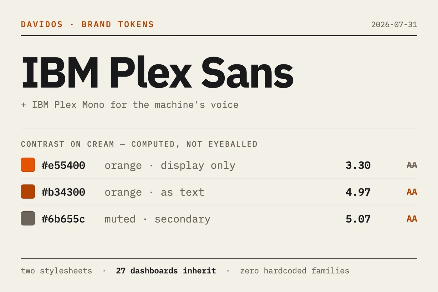
I spent a week building a new site for myself. Somewhere around the third pass I noticed I'd stopped choosing type for the site and started choosing type for everything I make.
So I made it official. IBM Plex Sans for display and body, IBM Plex Mono for anything the machine says. Then I applied it everywhere at once.
The whole argument for tokens, in one afternoon
DavidOS renders 27 HTML dashboards. Every one of them links one of two shared stylesheets, and not a single page names a typeface. They ask for --sm-font-display, --sm-font-ui, --sm-font-technical, and take whatever those resolve to.
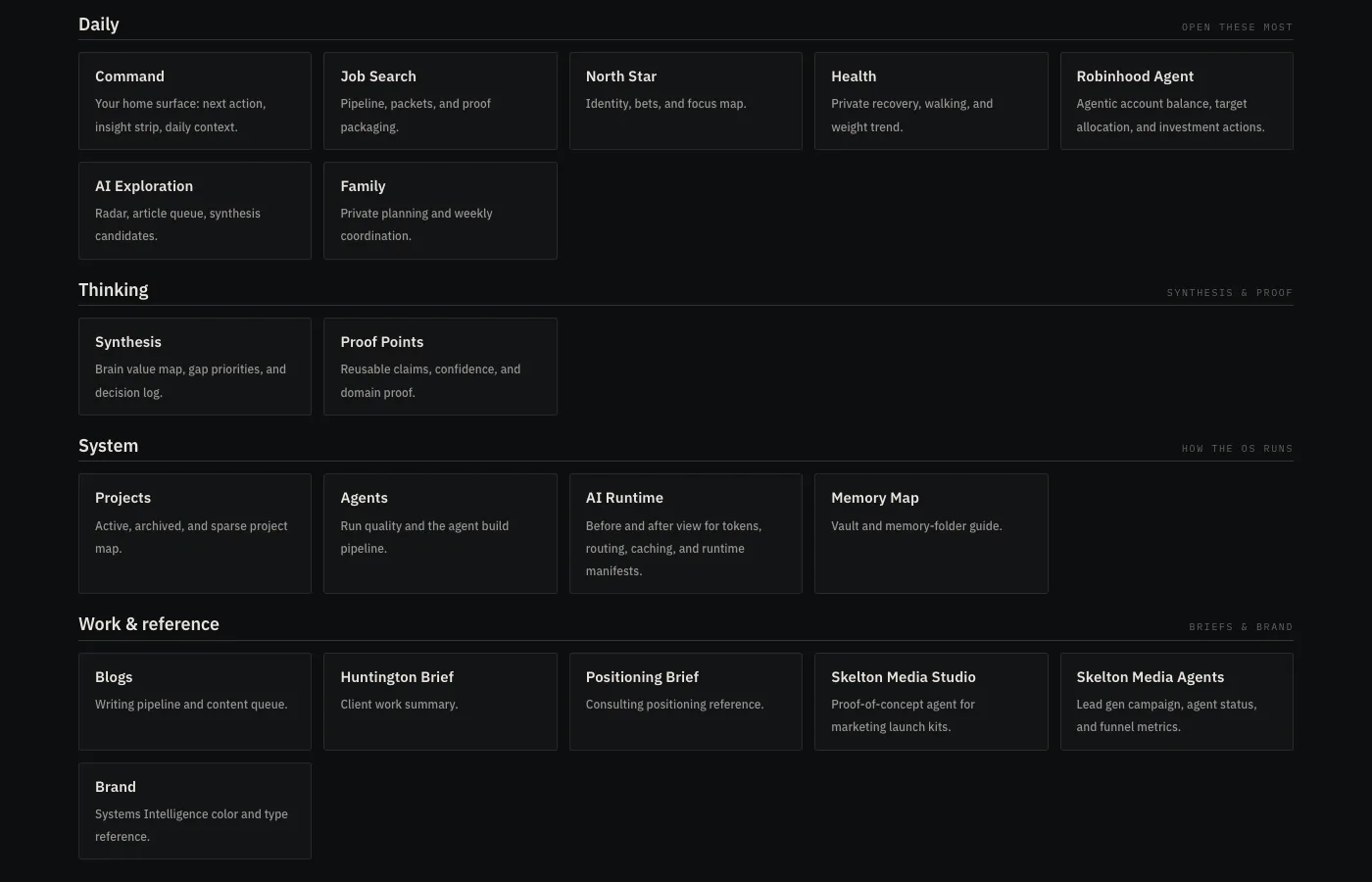
Changing the type across all 27 surfaces meant editing two files.
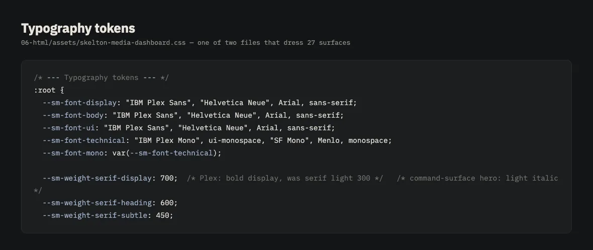
That's the case for design tokens, and it's worth stating plainly because token conversations get abstract fast. The value isn't tidiness. It's that a decision made once on a Tuesday reaches every surface you own without a migration project, a ticket, or someone opening 27 files and hoping they caught them all.
The uncomfortable half of that: any page that hardcodes a family silently opts out of every future decision you make. I went looking for those. There were none, which is the only reason one edit worked.
What the serif era got wrong
The previous system set display type and large numerals in Source Serif 4 at weight 300, italic. Light italic serif is a lovely setting. It is also a magazine setting.
These dashboards report agent runs, portfolio drift, application counts, health signals. They should read like instrumentation. Light italic serif made the numbers look editorial, like a pull quote about data rather than the data.
Plex Sans at 700, upright, does the opposite. It was drawn for IBM's technical documentation and it carries that job with it: engineered, legible small, unfussy about being looked at.
Source Serif is retired from DavidOS interfaces. The TTFs stay on disk so older PDFs still render. Nothing new uses it.
I computed the contrast instead of looking at it
The brand orange is #e55400. On the cream ground #f4f0e8 it measures 3.30:1. WCAG AA wants 4.5:1 for body text, so it fails, and it fails in a way that's easy to miss because orange on cream looks confident at large sizes.
The orange became two tokens. #e55400 stays the brand orange for marks, rules, and display. A second token, #b34300, carries orange that has to be read as text. It measures 4.97:1.
The same pass caught the muted grey at 4.38:1. Re-stepped to #6b655c, now 5.07:1.
Dark mode needed neither fix. On the dark ground #141516 the raw brand orange measures 4.88:1 and passes on its own, so the text-orange token resolves back to #e55400 there. The hue never changed. The ground did.
I had these wrong by eye in both directions before I ran the numbers. Contrast is arithmetic, and I don't trust designers who estimate it, including me.
The exceptions are the interesting part
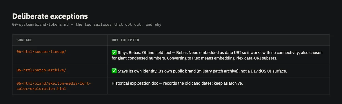
Two surfaces don't follow the type system, deliberately.
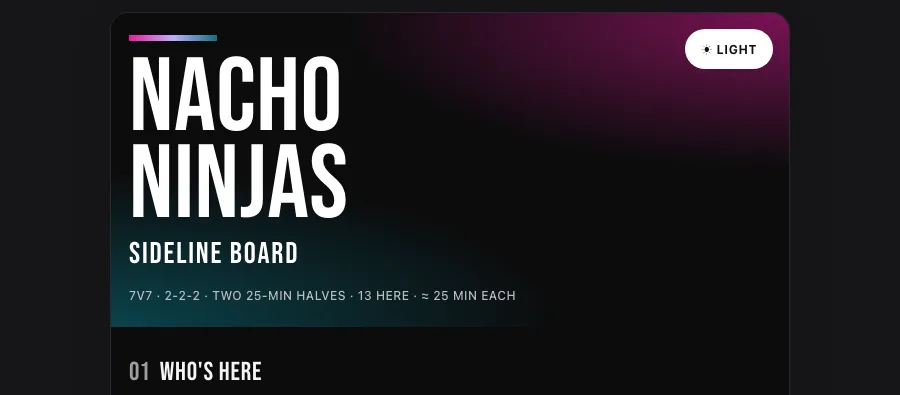
The sideline board I use to coach 3rd/4th-grade soccer keeps Bebas Neue. It's an offline field tool with the face embedded as a data URI so it works standing on grass with no signal, and it needs enormous condensed numerals readable at arm's length in sun. Converting it would cost me the embedding work and the numerals, and buy nothing.
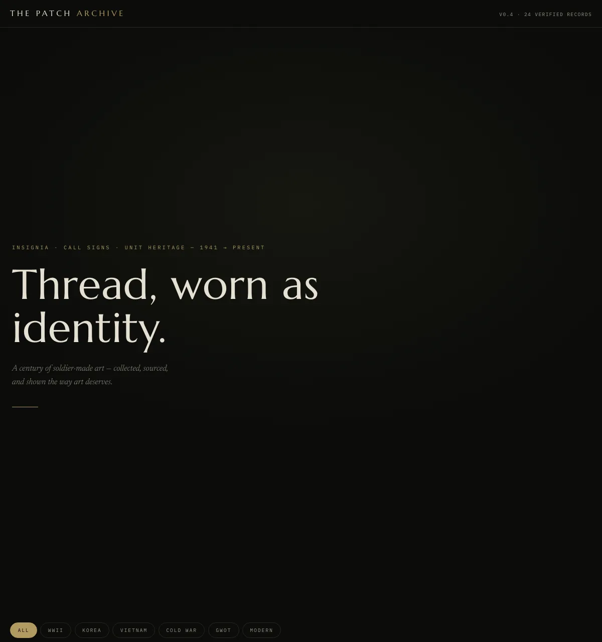
The patch archive keeps its own identity because it isn't a DavidOS surface at all. It's a public project with its own brand. Forcing my system onto it would make it look like my dashboard instead of itself.
A design system that can't name its exceptions isn't a system, it's a mandate, and mandates get quietly violated until nobody trusts the document. Both exceptions are written into the token file with the reasoning, so the next person who notices the inconsistency finds an answer rather than a bug.
The specimen that changed nothing
I also rendered seven treatments of my own name. Mixed weights, mono, condensed, a version with an orange period. Set them side by side and looked.
Then I kept exactly what I already had: Plex Sans 700, title case.
The hour was still worth spending. Before it, the wordmark was a default nobody had examined. After it, it's a decision, recorded in the token file with a line saying not to restyle it without a new decision in the same place. Those are different things even when the pixels are identical.